5 ways to make your neocities site more accessible
So you have a static site. You've hand coded the markup and styling, and it's a breathtaking sight to behold. Perhaps you're wondering if it's accessible. (And if you're not wondering this, I would encourage you to give it some thought.)
While it's true that the rules of web accessibility can be sometimes complex, there are a few simple things that you can keep in mind when developing static sites that will have a tremendous impact on those who wish to partake of your work.
Do not remove focus styling on interact-able elements.
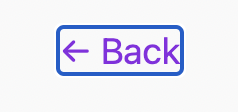
You can alter it to suit your site's aesthetic, but ensure that it remains clearly visible. Keyboard users must have a visible indication of the element they are focusing. Without this, the user will likely become lost attempting to navigate your website. You can test keyboard navigation on your website by pressing the "Tab" key to jump to the next focusable element, or "Shift + Tab" to jump to the previous.
Example: A focused link from this website with a visible focus ring -

Use HTML semantically.
This can become a rabbit hole with more complex markup, but there are a few common errors that can be easily demonstrated and corrected:
📍 Do not use the "anchor" and "button" tags interchangeably. They are programmed to behave differently when accessed by a screen reader. Use an anchor tag when you want to navigate the user somewhere. For all other interaction, use a button.
📍Avoid using "div" and "span" tags to hold meaningful content. These tags are primarily meant to be used as container elements, and they do not receive any contextual handling when accessed by a screen reader. There are many other semantic tags to use for your content instead. A common tag is the "paragraph" tag for any length of general text content.
📍 Header tags on the page should follow a natural hierarchy (h1 > h2 > h3, etc.). Do not use "header" tags exclusively for their native font sizes. If you need that h1 to be smaller, target it with CSS instead of using a top level h3.
Provide image descriptions for low/no sight users with the "alt" attribute on "image" tags.
The content of your alt tag should describe the image in detail. Use natural language and sentence structure, imagine that you are describing the photo for yourself if you were blind. Including words such as "image" or "photo" are redundant, as screen readers will first announce that the element is an image.
Example:
<img src="someSource.jpeg" alt="A stack of seven pancakes slathered in golden syrup and garnished with several blueberries and bananas."/>Maintain readability by ensuring that text and background color contrast is high enough to discern between them both.
For example, pink text on a slightly lighter pink background makes content difficult to read, particularly for those with low vision. This color contrast checker is an excellent tool for determining color contrast accessibility when you're unsure.
Avoid use of "autoplay" on media.
This may come as a bit of a bummer, as it's normal to want to share your favorite song or video with site guests. However, when you autoplay media without consent it can present a confusing situation for those with cognitive disabilities - especially if the source of the sound is difficult to locate. Sound can also overpower screen reader output, making for a frustrating experience for those who depend upon this technology. Additionally, some videos may be dangerous for viewers with photosensitivity, and it is best to allow them to decide for themselves if the video is safe to play.
This is by no means an exhaustive list, but it covers a large chunk of common mistakes that lead to poor web accessibility. If you're unsure if your site is accessible, Wave is a wonderful tool that will conduct a "scan" of your page to determine baseline accessibility violations.
The small web is a wonderous thing, although it can be a bit of a "wild west" when it comes to accessibility. With these few tricks in mind, we can work together to make the small web more usable for all who wish to enjoy it. 💞